
Located at: Customize → Header Settings
Controls the appearance and behavior of the site header.
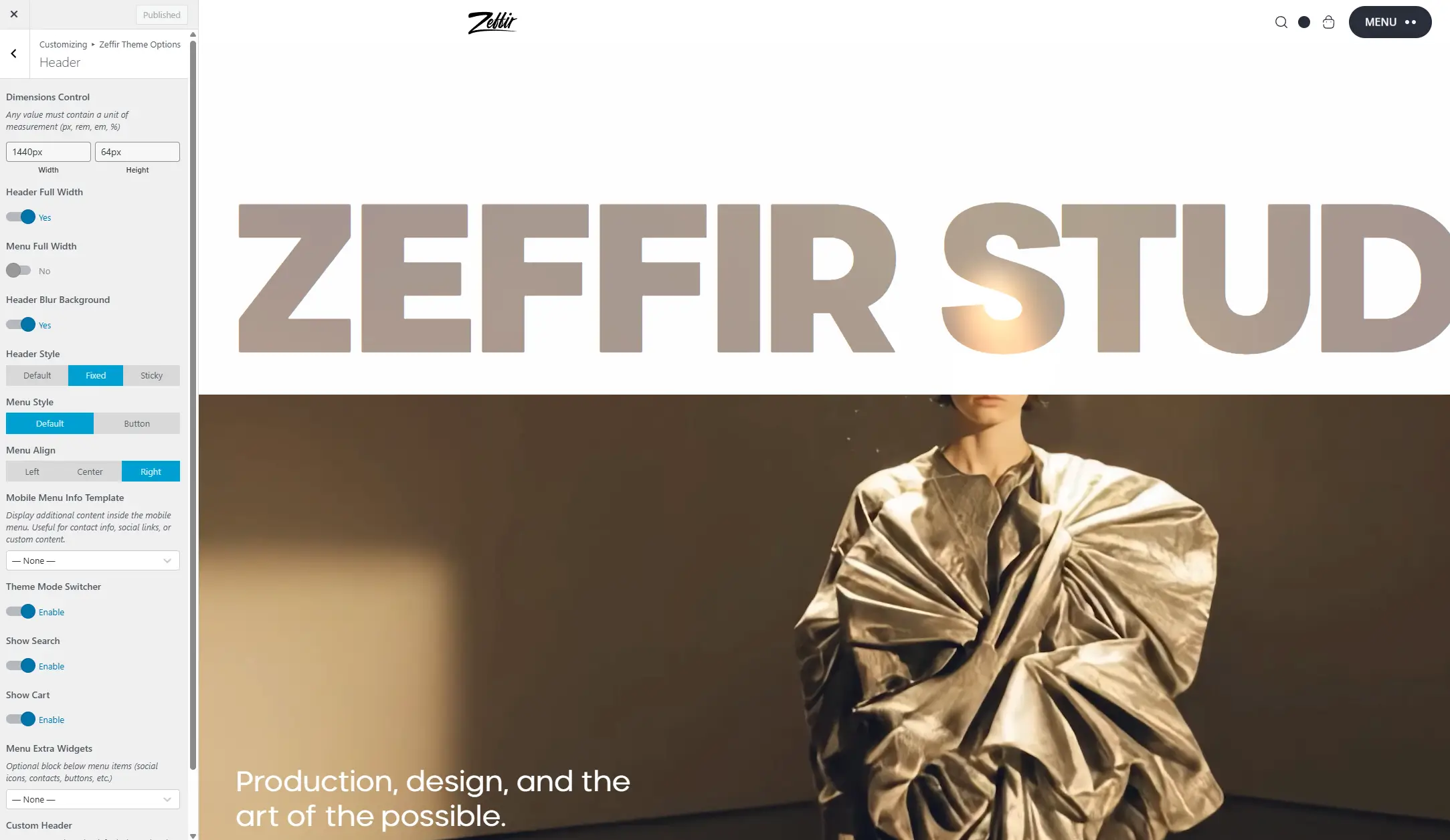
Dimensions
Width – Sets the maximum width of the header container. Default: 1440px. Use this to limit how wide the header stretches on large screens.
Height – Sets the height of the header bar. Default: 80px.
Layout
Header Full Width
ON — The header spans the full width of the browser. The menu will be displayed inside a separate boxed container.
OFF — The header is constrained to the Width value above.
Menu Full Width – Only visible when Header Full Width is ON.
ON — The navigation menu also stretches full width.
OFF — The menu stays within the content container.
Header Blur Background – Adds a frosted glass blur effect to the header background. Works best when the header has a semi-transparent color.
Header Style
Default – The header stays at the top of the page in its normal position. It scrolls away with the page content.
Fixed – The header is locked to the top of the browser window at all times, even while scrolling.
Sticky – The header is hidden when scrolling down, and smoothly reappears when scrolling back up.
Menu Style
Default – Standard horizontal navigation menu with links displayed directly in the header.
Button – The menu is hidden behind a hamburger/toggle button. Clicking the button opens the full-screen or slide-in mobile menu panel.
Menu Align
Only visible when Menu Style is set to Default. Controls the horizontal alignment of the navigation links.
Left / Center / Right
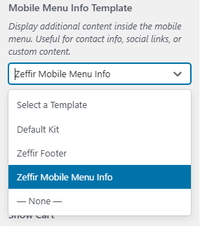
Mobile Menu Info Template
Lets you display additional content inside the mobile menu panel, such as contact information, social icons, or any custom content.
How to use:
- Go to Elementor → Templates → Add New
- Set type to Section
- Design your content
- Come back here and select it from the dropdown
Theme Mode Switcher
Enables or disables the dark / light mode toggle button in the header. When enabled, visitors can switch between light and dark mode manually. Their preference is saved in a cookie.
Show Search
Enables or disables the search icon in the header widgets area (right side of the header).
Show Cart
(Visible only if WooCommerce is active)
Enables or disables the shopping cart icon in the header. The cart shows the number of items currently in the cart.
Menu Extra Widgets
An optional block displayed alongside the menu. Useful for adding social icons, phone numbers, or buttons next to the navigation.
How to use:
- Create any Elementor template (Section or Header type)
- Select it from this dropdown
Extra Widgets Position
Only visible when Menu Style is set to Button.
Controls where the extra widget block appears:
Before Menu Button – displayed to the left of the toggle
After Menu Button – displayed to the right of the toggle
Custom Header
Allows you to completely replace the default theme header with your own custom Elementor header template.
OFF — Uses the built-in theme header (recommended)
ON — Uses a custom Elementor header template
Custom Header Template
Visible when Custom Header is ON. Select the Elementor Header template to display globally.
How to use:
- Go to Elementor → Templates → Add New
- Set type to Header
- Design your header
- Select it here